
These
words written by Rene Descartes over 300 years ago never cease to inspire me and I use them like a mantra to keep me sane when too much reality takes over ...
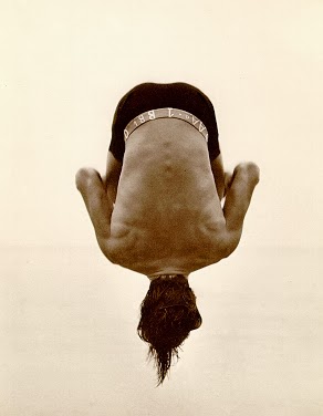 |
| Backflip in paradise Cove by Herb Ritts |
Out of all the artistic influences that have shaped my life, I've been lucky to have had my mother's creative talent as one of the most important. A designer by passion and by training, she never missed an opportunity to teach her children that beauty and inspiration can be found in almost everything. And having spent the formative years of my professional life learning the trade from her, I observed as close as one can get the true power of original creation when it is focused on the effort of resolving a design problem: it is usually spontaneous, often simple and when successful it is generally ... elegant.
 |
| My mother, Graça Viterbo on a site visit (1999) |
These
thoughts came to mind when I came across the work of Massimo Vignelli,
a multi-disciplinary Italian designer who, amongst an astounding body of work, is most often remembered for his iconic signage of the New
York subway. A mentor to a generation of designers through his
influential work for large companies like Knoll, IBM, American Airlines, Bloomingdale’s, ... he was a true believer in intellectual elegance as the quintessential approach to every design problem.
He had the self-confidence of visionaries who disrupt conventional frameworks through innovative thinking. He despised the concept of focus groups and the notion that design can be the outcome of the average response of a representative group.
Essentially, he believed that true creators develop the answer before other people even formulate the question. As he said in a seminal conversation with Debbie Millman:
He had the self-confidence of visionaries who disrupt conventional frameworks through innovative thinking. He despised the concept of focus groups and the notion that design can be the outcome of the average response of a representative group.
 |
| "Vignelli Forever" series by Anthony Neil Dart |
Essentially, he believed that true creators develop the answer before other people even formulate the question. As he said in a seminal conversation with Debbie Millman:
"People do not know what they want. They barely know what they need, but they definitely do not know what they want. They’re conditioned by the limited imagination of what is possible."Connecting the dots with my own experience, I realize that I grew-up exposed to a similar kind of thinking at home. It was perhaps not crystallized intellectually, but what I always appreciated about my mother's design approach was the innate elegance in her intuitive exploration of what was already there ...
Most of my professional life has been spent interacting with
designers and I am truly fascinated by all those who simplify the act of creation and eliminate
the redundant layers that can often cloud our perception of beauty. In the words of another elegant thinker, simplicity is the ultimate sophistication.
In my
creative process I always strive to be guided by this principle, and I'll paraphrase Maestro Vignelli to call it "elegant creativity". Whenever the creative process gets muddled by an over-reliance on trends and fashion or even on
over-intellectualized concepts, I tell myself not to
try so hard. The answer is often in the question and for interior designers and
architects, it starts with the basic exploration of the sense of place and then asking what that
place wants to be.
But
Vignelli was also guided by the notion that practicality is the key to transform
ideas into solutions that actually address our clients' needs. It was in its flawless
execution that he was able to disseminate so broadly his elegant thinking:
By listening as much as I can. I am convinced the solution is always in the problem. You could do a design that you like, but it doesn't solve the problem. Design must solve a problem. Then, the design is exciting. But I find it extremely difficult. This is why I respect artists. Without a problem, I don’t exist. Artists are lucky; they can work by themselves. They don’t need a problem.
Massimo Vignelli in Design Matters with Debbie Millman
Vignelli
was not unique but his work has certainly been an inspiration, and looking
around we see these same principles guiding the work of other contemporary
designers and artists that are defining their time: Jony Ive, Paul Smith, Norman Foster, Karim Rashid, Patrick
Jouin, Andre Fu and others ... These are but some of the creators that constantly remind me that the act of creation is never successful if we hide behind aesthetics. Instead we succeed by celebrating the unique ability that human beings have to re-interpret and re-invent the world around them.
 |
Desk designed by Jonathan Ive and Marc Newson
for the (RED) charity auction
|
 |
| Public restroom at The Upper House by Andre Fu (AFSO) |
 |
| The elegance of Paul Smith's stripes |
 |
| Van Cleef & Arpels (Paris) by Patrick Jouin |


